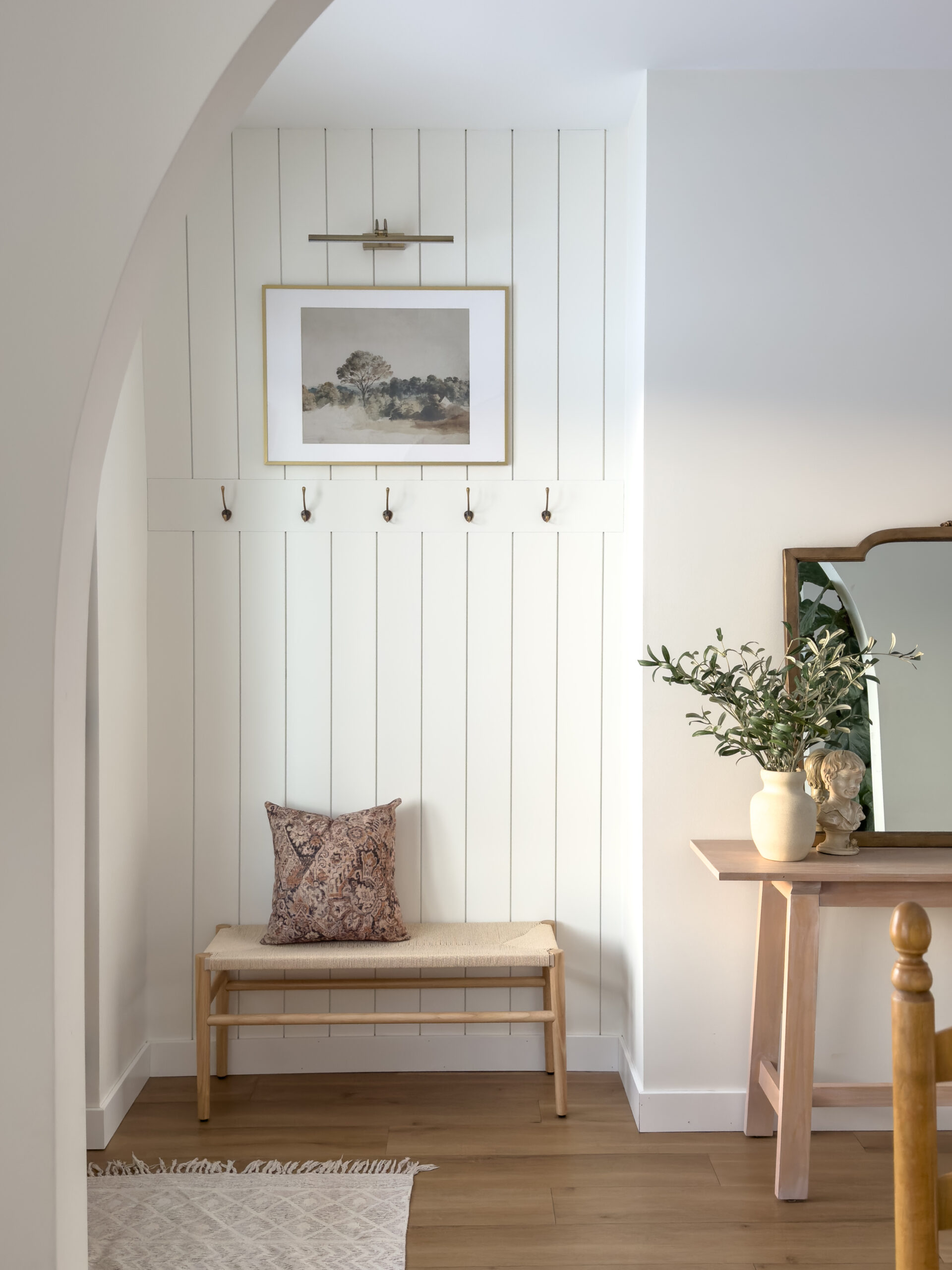
Hey friends, today I want to share all details on our front entrance nook with you! We chose a transitional design that is simple, elegant and classy.
When building our home we decided that have a mudroom attached to the garage to use as our personal entrance, so we opted out of a closet in our main entrance and instead made a little nook for guests to hang up their coats, and a little place for them to sit down if they need to.
(This post contains affiliate links to amazon and LTK that I make a small commisison from with no extra costs added to you.)
Size of our entrance nook
This space is 55 inches wide and 17 1/2 inches deep. This originally should have been a closed closet, however we decided to open it up and make it pretty. It’s the first thing guests see when walking in so I love this being a visually pleasing corner.


Shiplap
There was a lot of back and forth on what kind of wall treatment we should do, but I quickly knew I wanted to go with vertical shiplap. I love the look! It adds height to this small space and totally transformed our space. It also adds a modern transitional look which was exactly what I was going for.

Bench
After a lot of back and forth on a bench for this entrance nook we decided on this beautiful wicker bench. It fits perfectly size wise and adds more charm! I was surprised how sturdy it is. Definitely a winner!


Art
No space is complete without a beautiful art piece! Etsy has so many good digital prints, and I decided on this beautiful landscape picture. I purchased the digital print, and then had it printed. I wrote a blog post on how to do this if you need a little guidance.You can read it here. The frame I purchased from Ikea.


Colour of our entrance nook
All of our walls in our home are Simply white by Benjamin more and we decided we wanted this space to be the same colour. Since it is a small space we wanted it too stay white and bright, no regrets there!


Picture light
I absolutely love this detail! After I found out that you can get battery operated picture lights I knew I wanted one for this space. Thats right, it doesn’t need to be hardwired! It adds such a cozy ambiance in the evenings, and enhances focus on the beautiful artwork.

Final thoughts
I am so happy how this little corner turned out! I have no regrets and I love that is adds so much charm and visual interest without any huge costs. If you want to to elevate your entrance space then I hope you got some inspiration from this post! I would love to hear from you!

Sources
(This post contains affiliate links to amazon and LTK that I make a small commisison from with no extra costs added to you.)

One thought on “All the details on our entrance nook”
Comments are closed.